Applies to:
- Winshuttle Foundation
Element properties A-Z
The following table provides a brief description of the various properties available in the Properties pane for each Element. Properties specific to certain elements can be found on the page describing the element.
Note:Not all properties apply to all elements.

Tip: You can also access element and solution properties from the Solution Tree.

- In Composer, click the Solution Tab.
- In the Solution Tree, right-click an element or other item, and then click Properties.
Element Properties Table
Property |
Value type |
Description |
|
Arguments |
Special |
Create a logical argument with Field Values, Operators, Functions, and Nodes. Used to create customized form logic and pass data between form elements. For example, you can create a button that triggers a plugin, and then configure the arguments to pass specific information to the plugin for processing. See Working with arguments for additional information. |
|
Available Options Only |
True | False |
|
|
Background color |
Menu selection |
Changes the background color for a Group element. |
|
Binding |
Menu selection |
The name (not the label) of the form field to which an element is bound. |
|
Border Color |
Menu selection |
Specifies the color of the border around the element (e.g., black, red, gray, etc.). |
|
Border Style |
Menu selection |
Specifies the style of border displayed around an element. For example: Solid, Dashed, Dotted, Inset, etc. |
|
Border Width |
Menu selection |
Specifies the thickness of the border around an element: thin, thick, thicker, thickest. |
|
Button Behavior |
Cancel | Complete | Reject | Save | Save and Run | Run Embedded plugin | Delete | Custom |
Sets button behavior to a preset (Cancel, Save, etc.) or customized function. Selecting Custom enables the Rules option so you can create a custom rule that will govern the button's behavior. |
|
Collapsible |
Expanded | Collapsed | Non-Collapsible |
|
|
Collapsible Field Reference |
Field name |
This lets you select a boolean field to control the collapse state of a group. For example, you can use this to hide/expose groups depending on whether or not a checkbox is selected. This property adds a checkbox into the header of the group. This checkbox combines setting the boolean field value (based on the check-box state) as well as the group collapse state (i.e. whether or not it is expanded (checked) or collapsed (not checked). |
|
Columns |
Number |
The number of columns for the element. |
|
Column Span |
Number (1-6) |
The number of columns the element will span. Applies to Basic and Helper elements only. If a Group is configured to have more than one (1) column, the Column Span property on any element within the group will span the set number of columns. |
|
Date Format |
Menu selection |
The format style of a date entry, e.g. mm/dd/yyyy. |
|
Default Value |
Number/Text |
The default value for an element. |
|
Element Type |
TextBox | Text Area | Dropdown | ComboBox | Date Picker | Number | Email | Checkbox | Radio Button |
Lets you quickly change a basic element (such as a Text Box) to another, similar type of basic element, such as a Dropdown or Combo Box. |
|
Enable Autocomplete |
True | False |
|
|
Enable Excel Operations |
True | False |
|
|
Enable Rich Text |
True | False |
This applies to the Text element Text Area (but not Text Box).
|
|
Enable Runtime Edit |
True | False |
This applies to the HTML element.
|
|
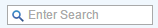
Enable Search |
True | False |
Enable or disable a search box for searching or filtering information in a table.
|
|
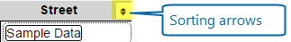
Enable Sort |
True | False |
|
|
Enable Validation Results |
True | False |
|
| Field Encryption | True | False |
See Composer Field Encryption for more information. |
|
Image Alternate |
Text |
Alternate text (Alt Text) for an image inserted into a form. |
|
Image Height |
Number |
The height of the image in pixels. |
|
Image Source |
File path |
The file system path to the image, e.g., C:\images. |
|
Image Width |
Number |
The width of the image in pixels. |
|
Input Type |
Menu selection |
The type of input for a form field: TextBox, Dropdown, Email, Number, Checkbox, DatePicker. |
|
Key Column for Merging |
Table Column |
This property supports concurrent editing of table data (i.e. when multiple users might make changes to the same table at the same time). The Key Column is a field within the table that contains a unique identifier. This field must not be duplicated within the table, and it is required to support the data merging that takes place when the form is saved. |
|
Max Characters |
Number |
The maximum number of characters a user will be allowed to type into the field. Default value is 80. |
|
Min Characters |
Number |
The minimum number of characters a user will be allowed to type into the field. Default value is 80. |
|
New Item Location |
Top-right | Top-Left | Bottom-Left | Bottom-Right | Both - Left | Both - Right |
The location of the '(+) Add new item' option in a repeating table or repeating group.
|
|
Name |
Text |
The internal name for an element in the form. |
|
Orientation |
Vertical | Horizontal |
|
|
Padding |
Small | Medium | Large |
The padding (space) around an image (top, bottom, left, and right). |
|
True | False |
|
|
|
Payload Store Type [BETA] |
Dropdown list |
This is a BETA feature that can be used to store the table data outside of the Form XML. There is also a server configuration setting associated with this feature that must be configured by an administrator. |
|
Placeholder Text |
Text |
Placeholder text is a short description or hint that that describes the expected value of an input field. (For example, "Enter phone number xxx-xxx-xxxx"). The short hint is displayed in the input field before the user enters a value. |
|
Promote to SharePoint (Field) |
Text |
Name of the SharePoint Field text will be promoted to. |
| True | False |
When you change style or properties for common labels in a Composer form with multiple views, you will be prompted by a dialog box asking if you want to apply the changes to all views. Setting this option to True automatically propagates style or property changes to all applicable views without prompting. |
|
|
Range |
Special |
Enter a range of possible values manually or from a data connection (to a SharePoint List, for example) that the form user can select from. |
|
Read Only |
True | False |
|
|
Refresh default value |
True | False |
(Note for Microsoft InfoPath users: This is the same functionality as the "Refresh value when formula is recalculated" setting.) |
|
Required |
True | False |
|
|
Row Count |
Number |
Specifies the number of rows to display in a repeating table before paginating content. |
|
Rules |
Special |
Click to view (or create) any Rules (logic, formulas, etc.) applied to an element. |
|
Special |
Use this to specify a plugin (for example, Clone Files), and the arguments (parameters) to pass to the plugin. |
|
|
Run Rules on Form Creation Only |
True | False |
|
|
Save Content |
True | False |
This setting applies to Selectable Tables.
|
|
Show Header |
True | False |
|
|
Show Sub-Labels |
True | False |
|
|
Signature Accept Rule |
Special |
Clicking Accept will trigger the specified rule. Note: The Required property (see above) must be set to True to access this property. |
|
Signature Clear Rule |
Special |
Clicking Clear will trigger the specified rule. Note: The Required property (see above) must be set to True to access this property. |
|
Table Width |
Number |
Specifies a width in pixels for the width of the Table and enables a horizontal scrollbar (if applicable). This is useful when there are a large number of columns in the Table. |
|
Tool Tip |
Text |
Text that appears as a tooltip when the user hovers the mouse over a field. |
|
Translation Override |
Menu selection |
Enables you to override language translation for an element for a specific language. |
|
Width |
Number (%) |
The width of the element in the form, expressed as a percentage (1-100%). |