Applies to:
- Winshuttle Foundation
Types of rules
There are 4 basic types of rules in Winshuttle Composer: Validation, Formatting, Action, and JavaScript (see the JavaScript reference guide for more information about JavaScript rules.)
Each type of rule is also governed by a common set of General Properties.
On this page
- General rule properties
- Validation rules
- Formatting rules
- Action rules
- Action Rule Quick Reference Table
General rule properties

Run Rule on Form Load
Indicates whether or not the rule should be executed immediately when the form is loaded.
Halt Execution in Debugger Before running this rule
This option is good for troubleshooting rules. Enabling this option inserts a debug breakpoint into the javascript code just prior to executing the rule. If the browser Development Tools are active and this rule is executed, the browser debugging session will stop just prior to executing the rule for further interrogation of the code.
Disable Rule
Enabling this option stops the rule from running when the form is run.
Type
Specify the type of rule to create. Additional options will be displayed depending on the type of rule selected. Click a rule type for more information:
Condition
If the specified condition condition is true this rule will be run, otherwise it will not run.
Note: If you use a condition to compare against a SharePoint Yes/No column:
- The value must be True or False (without quotation marks, etc.)
- The first letter must be capitalized, i.e. True or False, not true/false
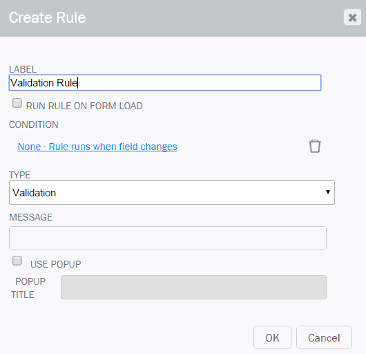
Validation rules
|
A Validation Rule can be used to display an error message when data entered into a form field is invalid. You can specify the conditions under which the error message is displayed. For example, you could create a rule to display an error if a number entered into a field is greater than a certain value, less than a certain value, or both.
|
|
Formatting rules
|
Formatting rules apply specific formatting to a form field when certain conditions are met. For example, if the value entered into a form field is too high, you can create a rule to change the form field to the color yellow.
|
|
Font Style Modifications |
Form Component Modifications |
|
Font style modifications (to apply the form component for this field)
|
To hide, require, or disable a field, create an Action Rule using Change Field Properties. See the entry for Change Field Properties in the Action Rule quick reference table for more information. Note: Solutions created in earlier versions of Composer (11.0.2 and earlier) will still display the following options.
New rules created in Composer 11.0.3 and later will need to use the new Action Rule - Change Field Properties as described above. |

Action rules
Action rules are the most versatile rules. Action rules can perform a wide range of functions, such as setting values in specific fields, comparing values in fields, calculating values based upon formulas, and more.
|
|
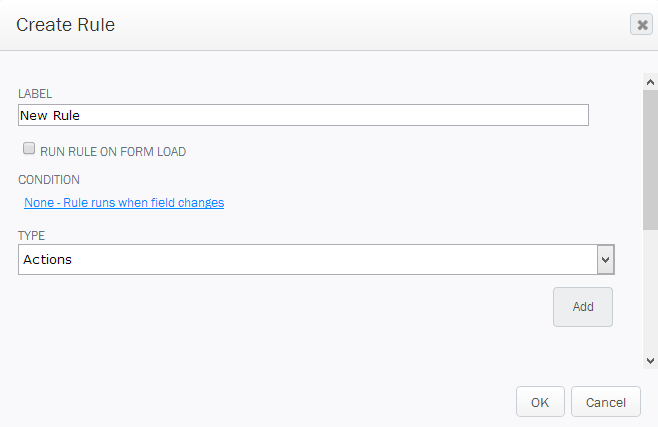
Once you have specified the basic information and conditions for an Action rule:
|
|
Action rule quick reference table
The table below provides an overview of available Action Rules, a description of what the rule does, and the parameters associated with the action.
Action |
Description |
|
Add New Row |
Adds a new row to a repeating table or group. Parameters
|
|
Change Field Properties |
Change a field's properties to show, hide, enable / disable, or require / not require input. Parameters
|
|
Change Group Display |
Shows, Hides, Expands, or Collapses a group based upon a specified field within the group. Parameters
|
| Copy Like Rows |
This rule can be used to copy rows from one repeating table or repeating group to a target repeating table or repeating group. This rule matches the column value in the source repeating element to determine which rows to copy based upon the selector field property. The Copy Rows Action determines if the matching rows should be overwritten or added to the target repeating element as new rows. |
|
Delete Row Options |
Parameters
|
|
Empty Table |
Clears all data out of a repeating table or group. Parameters
|
|
Execute Query |
Executes a Query control in the form. Parameters
|
|
Execute Rules for Field |
Runs the rule on another field. This can be useful if 2 fields have rules related to one another. Parameters
|
|
Execute Web Service |
Executes a web service control in the form. Parameters
|
|
Filter Repeating Content |
Enables the filtering of Repeating Tables/Groups while preserving the content. You can configure a “condition” to use with this -- for example, field1= “this” and field2 != “that”. Only the rows that satisfy the condition(s) will be displayed in the Repeating Table/Group. Parameters
|
|
New Row Options |
Parameters
|
|
Reload Drop Down Options |
Causes the options of a drop down list or Combo box to be reloaded. This may be used for dynamic options lists. Parameters
|
|
Render Map |
Sends a new address to a map control on the form. Parameters
|
|
Search Repeating Content |
This provides a mechanism to search all fields for a “pattern” (for example, if any field contains “abcd”). In this case all the rows where at least one field contains the pattern will be displayed in the Repeating Table/Group. Parameters
|
|
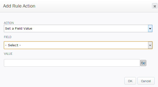
Set a Field Value |
This action allows you to change the value of a field in the form. Parameters
|
|
Set a Label |
This rule action is similar to Set a Field Value (above), but will change the Label (or sub-Label) of a Form Element. Parameters
|
|
Show Message |
This displays a pop up box with the message text specified in the rule. The properties on this rule are derived from a form's fields by default. |
|
Sort Repeating Content |
Sort the items in a repeating table. Parameters
|
|
Submit Form |
This action allows you to simulate the Submit button of the form. Parameters
|