Applies to:
- Winshuttle Foundation
Working with form elements
Related topics
Form elements are the building blocks you use to create forms. They include everything from simple labels, text boxes, and combo boxes to more advanced elements such as process controls, form validation controls, and others. Some elements can be connected to data sources (such as a SharePoint table column). For example, you could populate a form's drop-down box with a list pulled from a column in a SharePoint List or SQL database.
On this page
- Adding elements to a form
- Configuring elements
- Naming elements and fields
- Moving elements
- Configuring advanced elements
- Deleting elements
The following sections describe how to work with and configure elements from a general standpoint. For more specific information on each element, see the corresponding web page for that element.
- See Form Elements (A-Z) table for a complete list of all Composer Form Elements
- See Form element general properties table for a list and general description of the various element properties that can be configured.
Adding elements to a form
Back to top- In the canvas, click the group to which you want to add an element.
- In the Properties pane, click Elements.
- In the Properties pane, click the type of element you wish to add (Basic, Helper, Advanced, or Container).
- Click an element (Text Box, etc.) to add it to the form.
Tip: You can also drag elements into a Group.
Configuring elements in a form
Back to topThere are many different kinds of elements you can use in a form, and each element has different properties you can change to make the element behave differently in your form.
Elements have multiple sets of properties:
- Label Properties. Click the element's header or label to change.
- Input Field Properties. Click the element's input field (such as a form field) to change.
- Sub-Label Properties. Click an element's sub-label to change.
To change the properties of an element in a form:
- In the canvas, click the element you want to configure.
- The Properties pane displays the properties that apply to the element.
- Configure the element properties in the Properties pane.
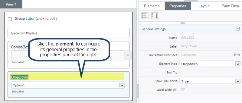
Above: General properties for a combo box element
Naming elements and fields
Back to topElements and fields work together to create what the user sees and uses to input data. When you place a text box on a form, the rectangle that the user enters data into is called a control. It controls how data is entered, but not where the data is stored.
Controls
Controls are connected to fields through a binding, which stores entered data into the bound field. Controls are displayed in the Layout tab, and on the form canvas where you create the form.
Controls have two naming components: A label and a name.
- The label is what gets shown on the form next to the control. It can have spaces and should be descriptive and meaningful to the person filling out the form.
- The name is used on the back-end to connect the control to rules and helper elements. The name cannot contain spaces or special characters.
Both the label and name can be used for other controls, i.e. you can have duplicate labels and names.
Fields
Fields are the containers that hold data, such as a number or text. Fields are displayed on the Form Data tab.
Fields only have one naming component, and it must be unique in the solution. You can change the name as long as it remains unique.
For example, if you have a field named material_description, and you need another material_description field for a different web service, Composer will automatically append a number to the most recently added field. The second material_description will become material_description_0.
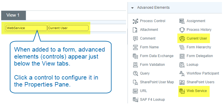
Configuring advanced elements (controls)
Back to topAdvanced elements (also called controls) are added to the top Form Canvas just below the View bar.
Click the element (control) to open its properties in the Properties Pane.
Configuring additional properties
Back to topMany elements have additional properties you must configure, such as drop-down lists, radio buttons, etc.
In the canvas, inside the element, click the item in the element to open additional properties in the Properties pane.
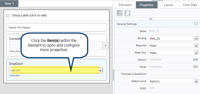
Above: Properties for the items in a combo box element
Moving elements
Back to topYou can move elements within a group or between groups.
Moving an element within a group
Right-click the element, and then select one of the following:
- Move to top: Moves the element to the top of the current group in which the element is located.
- Move up: Moves the element up one place within the current group in which the element is located.
- Move down: Moves the element down one place within the current group in which the element is located.
- Move to bottom: Moves the element to the bottom of the current group in which the element is located.
Moving or copying an element between groups
- In the canvas, click the element you want to copy.
- On the ribbon, click Cut (note: click Copy if you want to copy the element instead).
- In the canvas, click the group to which you want to move or copy the element.
- On the ribbon, click Paste.
Tip: You can also right-click an element and then select Cut, Copy, or Paste to do these actions.
Deleting elements in a form
Back to top- In the canvas, right-click the element, and then click Delete.
Note: You can also click the Delete button on the ribbon.